Time Series, Line charts, and Area charts
Introduction
Time series data is essential in finance, healthcare, business operations, server log analysis, and many other areas. Here we take a broad look at crunching temporal data in Java using the Tablesaw data science library.
About Tablesaw
Tablesaw is an open-source data science library for Java that combines tools for loading and transforming data with the ability to create statistical models and visualizations. You can think of it as a data frame, combined with visualization library. You can find more resources at the bottom of this article. In this article, we show how to use Tablesaw to easily create a variety of plots for representing the change in variables over time.
is Java for data science. It includes a dataframe and a visualization library, as well as utilities for loading, transforming, filtering, and summarizing data. It’s fast and careful with memory. If you work with data in Java, it may save you time and effort. Tablesaw also supports descriptive statistics and integrates well with the Smile machine learning library.
Time Series
You can create time series plots easily. The time axis adjusts the scale according to the size of the display area and the number of points displayed.
Loading Data
As always, we start with loading data.
Table bush = Table.read().csv("bush.csv")
This loads a CSV file and creates a table with typed columns.
Here’s an example:
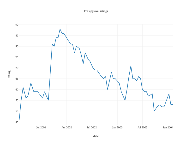
Table foxOnly = bush.where(bush.stringColumn("who").equalsIgnoreCase("fox"));

Plot.show(TimeSeriesPlot.create("Fox approval ratings", foxOnly, "date", "approval"));
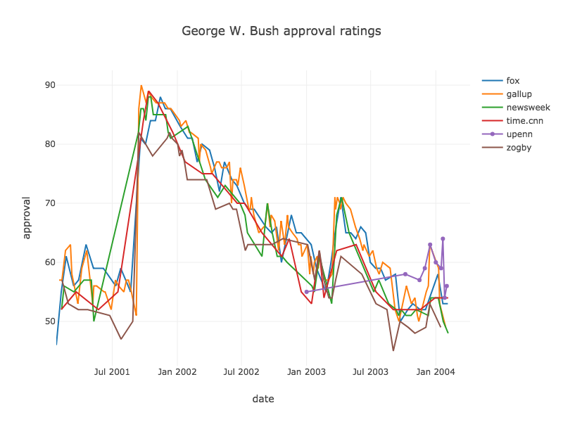
To see more than one series, we add a grouping column to the call to TimeSeriesPlot.show().This creates a separate line for each distinct value in that column. Here the grouping column is “who”, which holds the names of the organizations who conducted the poles.
Plot.show(
    TimeSeriesPlot.create("George W. Bush approval", bush, "date", "approval", "who"));
Line Charts
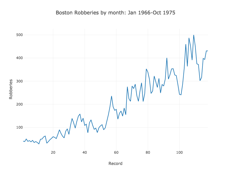
Perhaps the simplest way to present time-oriented data is to simply plot a set of observations in the order in which they occurred.
Table robberies = Table.read().csv("../data/boston-robberies.csv");
Plot.show(
    LinePlot.create("Monthly Boston Robberies: Jan 1966-Oct 1975",
              robberies, "Record", "Robberies"));
Area Charts
When the observations represent a level, an area chart can be a good choice.
Table robberies = Table.read().csv("../data/boston-robberies.csv");
Plot.show(
    LinePlot.create("Monthly Boston Robberies: Jan 1966-Oct 1975",
              robberies, "Record", "Robberies"));
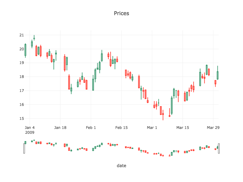
Working with financial time-series
Many financial datasets, especially those dealing with market prices, are in the form of a time series where price changes during a time period of a day, hour, or minute are represented by four variables: Open, High, Low, and Close. For example:
                                   ohlcdata.csv
    Date     |  Open   |  High   |   Low   |  Close  |    Volume    |  Adj Close  |
-----------------------------------------------------------------------------------
 2009-03-31  |  17.83  |  18.79  |  17.78  |  18.37  |  92,095,500  |      17.81  |
 2009-03-30  |  17.74  |  17.76  |  17.27  |  17.48  |  49,633,000  |      16.95  |
 2009-03-27  |  18.54  |  18.62  |  18.05  |  18.13  |  47,670,400  |      17.58  |
 2009-03-26  |  18.17  |  18.88  |  18.12  |  18.83  |  63,775,100  |      18.26  |
 2009-03-25  |  17.98  |  18.31  |  17.52  |  17.88  |  73,927,100  |      17.34  |
...
Open and Close are the prices at the beginning and end of the period, respectively. High and Low are the highest and lowest prices during the period. For these datasets, several specialized variations of time series have been created that show all four variables for each time point. We will look at two here: OHLC charts and Candlestick charts.
First we need to load the new dataset:
Table priceTable = Table.read().csv("../data/ohlcdata.csv");
Creating these charts can be done in a single line of code. We’ll look at OHLC chart first.
Plot.show(OHLCPlot.create("Prices", 	// The plot title
                          priceTable, 	// the table we loaded earlier
                          "date",		// our time variable
                          "open", 		// the price data...
                          "high",
                          "low",
                          "close"));

Candlestick Charts
Plot.show(CandlestickPlot.create("Prices", priceTable, "date","open", "high", "low", "close"));