2D and 3D Scatter Plots and Bubble Plots
Scatter plots are among the most popular and useful visualization options. We will use a wine dataset to demonstrate, starting with a simple scatter plot relating California champagne vintages and retail prices.
Yes, we are using champagne data to demonstrate bubble charts. How could we use anything else?
First we get our dataset and filter it.
Table wines = Table.read().csv("wine_test.csv");

Table champagne =
    wines.where(
    	wines.stringColumn("wine type").isEqualTo("Champagne & Sparkling")
    		.and(wines.stringColumn("region").isEqualTo("California")));
The plotting code is straightforward. This line creates and displays the plot.
Plot.show(
    ScatterPlot.create("Champagne prices by vintage",
                       champagne, "mean retail", "vintage"));
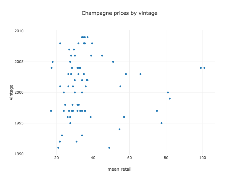
This kind of plot is easy to interpret but limited in expressiveness. By modifying it, you can show complex relationships between up to five variables (four numeric and one categorical).
Three variables
Adding a categorical column to the plot produces a series for each category.
Plot.show(
    ScatterPlot.create("Wine prices and ratings",
                       wines, "Mean Retail", "highest pro score", "wine type"));
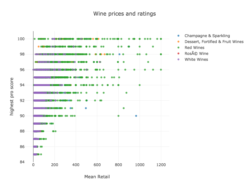
The legend on the right serves a dual purpose. It associates the colors with their categories, and it also allows you to remove or add a category to the plot by clicking its name.
To plot three numeric variables we can use a bubble plot or a 3D scatter. First we’ll use the bubble
Plot.show(
    BubblePlot.create("Average retail price for champagnes by vintage and rating",
                champagne,				// table
                "highest pro score",  	// x
                "vintage", 				// y
                "Mean Retail")); 		// bubble size
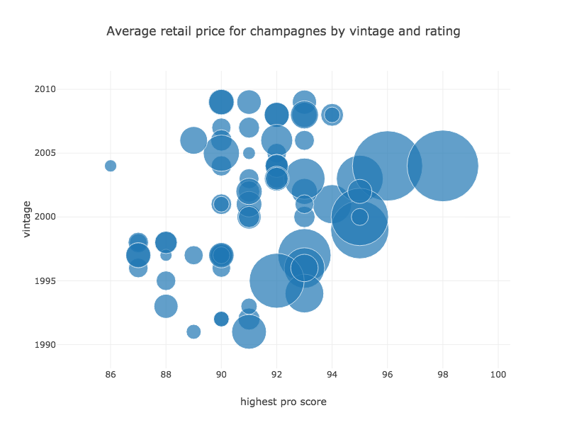
The size of the bubble is given by the last column “mean retail.” By default, values are mapped to the diameter of the bubble, but it’s possible to use area when creating a custom scatter plot.
To represent the same data in a 3D Scatter, you would use the Scatter3DPlot instead of BubblePlot. The rest of the code is the same. The variable represented by bubble size above is now represented on the z axis:
Plot.show(
    Scatter3DPlot.create("Average retail price for champagnes by vintage and rating",
                champagne,				// table
                "highest pro score",  	// x
                "vintage", 				// y
                "Mean Retail")); 		// z
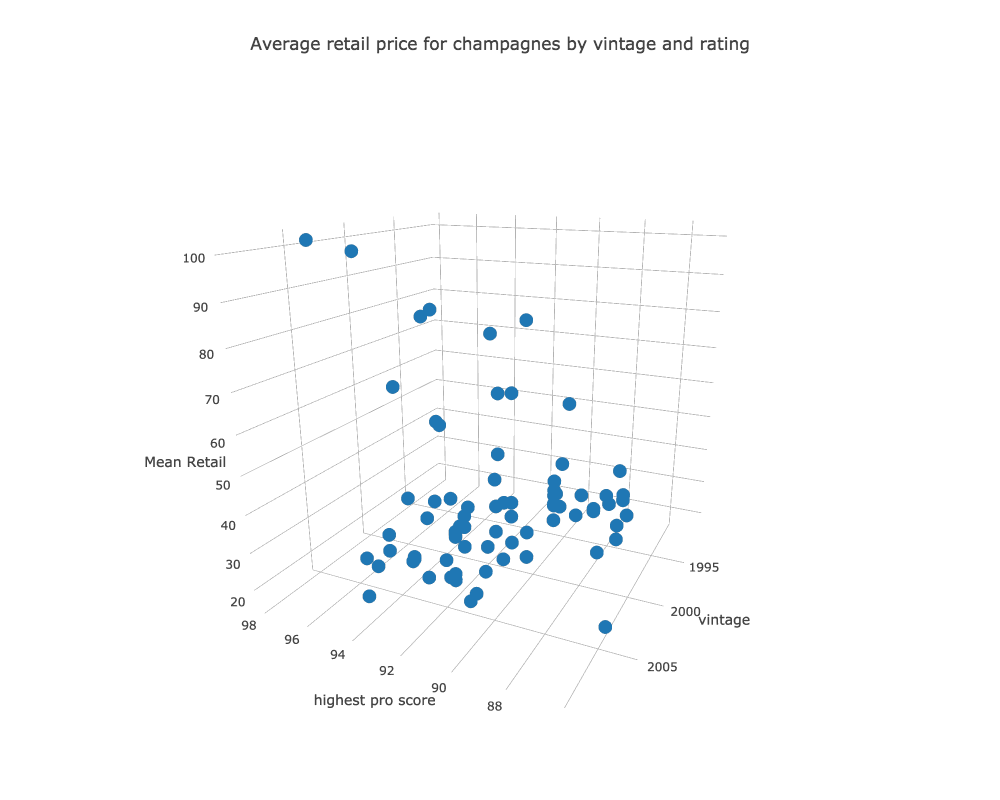
We can’t show it here, but these plots are rotatable in 3D space, and supporting panning and zooming like the 2D plots. Hovering over a point produces a label and draws a box connecting the highlighted point to each of the three axes.
Four variables
We can add a categorical variable to either the Bubble or the 3D scatter. First we’ll show the bubble version.
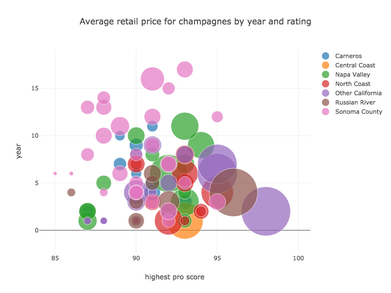
Plot.show(
    BubblePlot.create("Average retail price for champagnes by vintage and rating",
                champagne,
                "highest pro score",
                "vintage",
                "Mean Retail",
                "appellation"));
The grouping column is added to the end of the method. The result is shown below.
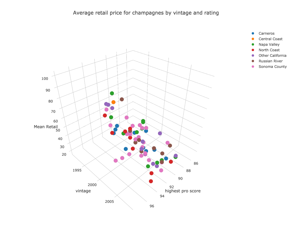
Let’s see the same four variables using a 3D scatter. First the code, and then the plot:
Plot.show(
    Scatter3DPlot.create("Average retail price for champagnes by vintage and rating",
                champagne,
                "highest pro score",
                "vintage",
                "Mean Retail",
                "appellation"));
Five variables
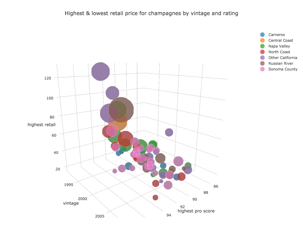
Now we’ll take one step further, just because we can. Here we add another numeric variable to the categorical 3D scatter plot above. As with the 2D scatter, we use point size for the new numeric variable.
Plot.show(
    Scatter3DPlot.create("High & low retail price for champagne by vintage and rating",
                champagne,
                "vintage",
                "highest pro score",
                "highest retail",
                "lowest retail",
                "appellation"));
Going Further
Use the code in the api package as a starting for your own explorations. The process of creating custom visualizations is covered here. Also be sure to look at related api classes for specialized plots like time series, line plots, or area plots.