Bars, Pies, and Pareto charts
Tablesaw is a platform for data science in Java that can filter and transform datasets. It also provides extensive support for visualization. For this discussion, we’ll use a Tornado dataset from NOAA, which can be found in the data folder of the Tablesaw project.
While Tablesaw can produce publication quality graphics, the focus here is on exploratory analysis, where content and ease are more important than polish. Here we focus on some common plot types for working with univariate data:
- Bar charts
- Pie charts
- Pareto charts
Example Code
All of the code used to produce the plots in this document can be found in the class BarPieAndParetoExample.java, which you can find here.
https://github.com/jtablesaw/tablesaw/blob/master/jsplot/src/test/java/tech/tablesaw/examples/BarPieAndParetoExample.java
We recommend you open that class to follow along.
Getting setup
First we load and clean the Tornado dataset. We use Table.read().csv() to open the file.
Next we clean the file. We want to work with the scale column. Tornadoes are assigned a scale from 0 to 5 according to their wind speed, but our dataset has missing values encoded as -9, which would throw off the graph. To fix this we set each value of -9 in the scale column to a missing-value indicator. Then we can create our plots.
Bar Plots
We start with the ubiquitous bar chart. Bar charts generally display data that has been summarized into groups. To create a bar chart, you need two things:
- Some numeric values
- Some categories to group them
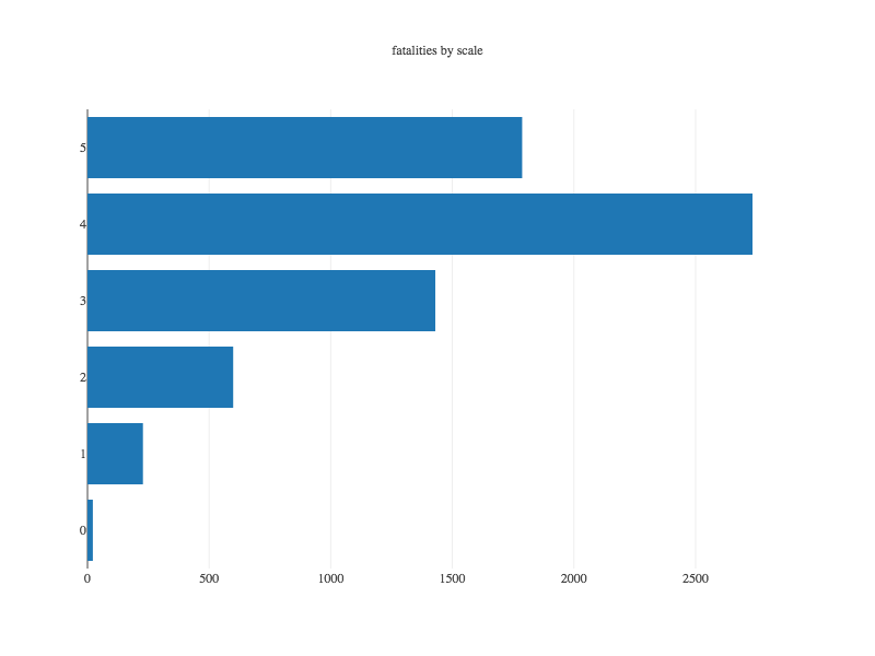
We start by counting tornado-related fatalities according to the intensity of the tornadoes.
Then we plot the results:
Plotting means, medians and other summary statistics
In the example above, we created plots that displayed the sum of values. We did this by first calling summarize() on our table, passing in the name of the column to summarize, the aggregation function sum, and applying a clause by() that specified how to group the data.
There are many aggregation functions defined in the class AggregationFunctions, such as sum, mean, median, standardDeviation, percentile(n), max, kurtosis, etc. We could have used any of those instead of sum. Here we’ll look at the mean values.
We follow the same strategy as above, using the summarize method to create a new table that collects the average number of injuries for each value of “scale”. Once we have that, we create and display the plot
In an upcoming section on advanced plotting features, we’ll cover how to create stacked and grouped bar plots.
Pie Plots
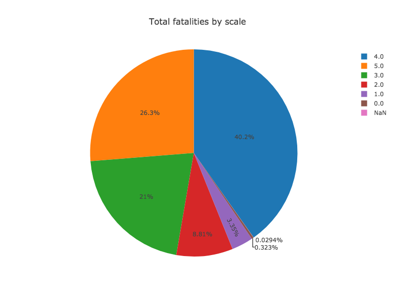
Pie plots are both widely criticized and ubiquitous. As a general rule, bar plots are easier to interpret, and so, generally, are to be preferred. We’d be remiss, however to not provide Pie Chart support. This example shows a pie plot that displays the same data as the first bar plot above:
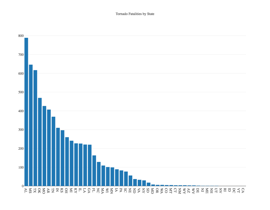
Pareto Plots
A simple variation on a bar plot is the Pareto Chart. In the plot below, fatality counts are summed by US state, and the results are sorted according to the totals in descending order. The example code has the details.